The 4.0 technology era is having a great influence in Vietnam. The number of websites and mobile applications is constantly increasing. That means the design of the application interface is more and more focused. Design trends 2018 are following the direction of Google’s Material simple design.
| Join the channel Telegram belong to AnonyViet 👉 Link 👈 |
I work a lot in the field of website interface (Front-end). Learn a lot of experience in this design style of the big Google. Most recently, I posted a demo video of my design skills at AnonyViet Fanpage.
If you like Google’s flat design style then take the time to read this. I have prepared a lot of good knowledge for you. These knowledge, I have learned in books and watched videos about Google’s design style that I have learned.
What is Material Style?
Simply put, this is a real material-based design style. The material that Google uses in the Material design style is hard paper. Hard paper has bright, harmonious colors and luxurious lines.
Imagine your screen is located in 3 XYZ axes as shown below.
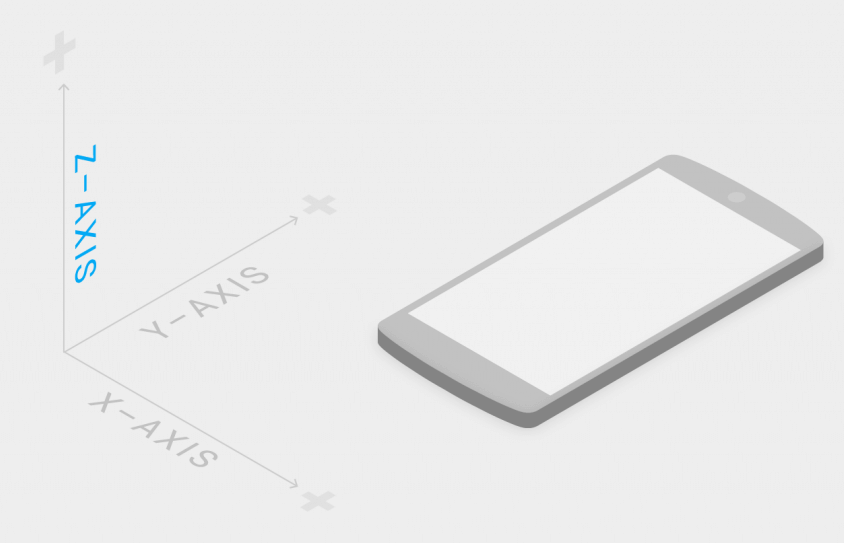
- X-axis – across the screen.
- Y axis – vertically on the screen.
- Finally, the Z axis will be the perpendicular axis (piercing the screen).
Our job is to cut the colored paper into the necessary shapes. Then arrange them into a logical layout on the screen with different levels of stacking (on the Z axis).
For example the interface of a normal mobile application you see is like this!
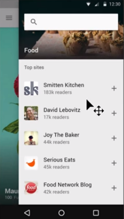
But looking at the Z axis, they are sheets of paper arranged like the picture below!
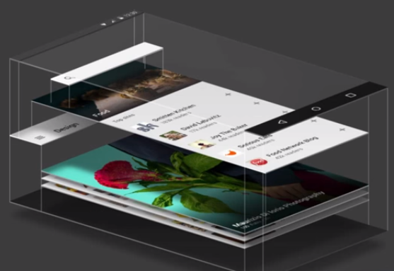
The sheets of paper that are cut out and arranged to float are the crux of Material design. To be able to represent the depth of the paper we will use a shadow effect. See the example below you will understand better.
Practical examples
For example, I have an application interface on the phone as shown below.
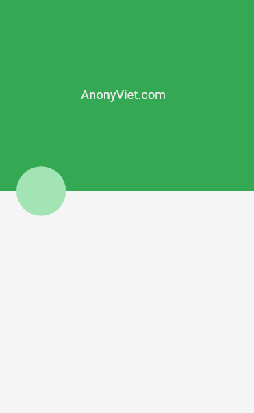
When you look at it, it will be difficult to feel which part is above and which part is below. You feel like it’s all 2D and it doesn’t give a sense of depth on the Z axis. Now, I’m going to try shading this design to see if it makes any difference!!
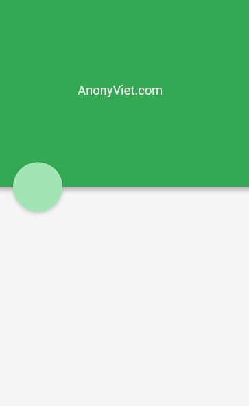
Wow, now you can clearly see the depth, right? Feel that the green part is on top and the white part is below. It’s simply a shadow, but it gives depth to your design, much like Google Design.
Introduction to Adobe XD design software
You can use Photoshop to design interfaces. But I’m a programmer, I’m tired of learning more Photoshop knowledge!! I have a much faster and efficient solution, which is to use Adobe XD (I used it in the video above).
This is software developed by Adobe to help programmers design UI/UX interfaces. The software is royalty-free by Adobe and very easy to use.
You can download it at the link below.
Download and install like any other software.
When you open the program, you will see the interface as shown below.
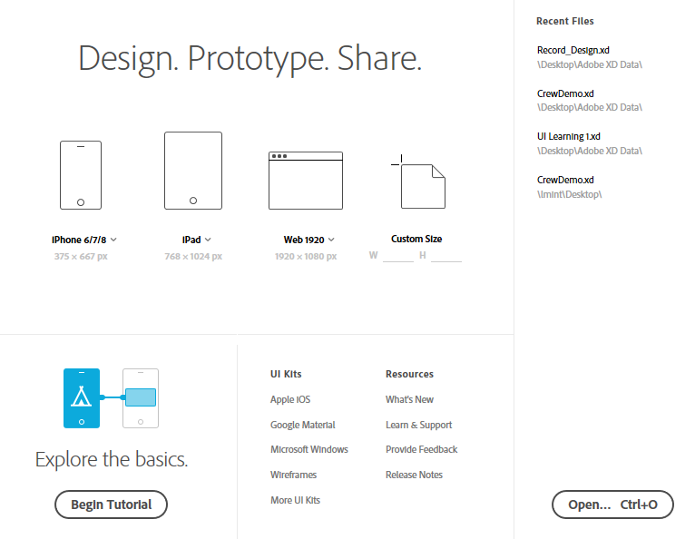
You can choose from a variety of screen styles for different devices to start designing. Above, I designed the interface on the screen of Iphone 6 Plus within 10s.
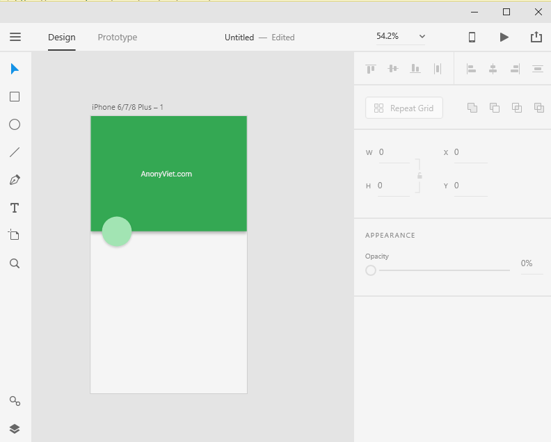
Adobe XD has only 8 simple design tools in the left sidebar. No need for complicated knowledge like in Adobe Photoshop. In addition, the software also strongly supports Material UI/UX design.
![]()
Adobe XD is very simple to use with drag and drop tools on the left. Adjust the parameters in the right sidebar. Here is a video tutorial to design with Adobe XD, you can check it out to get a deeper understanding of how to use 8 Adobe XD design tools.
Once done, you can export in different formats such as SVG, PNG, JPG, etc.
Epilogue
If you have any problems or questions during the design process. Please join AnonyViet’s private group to ask questions. Everyone in the group and the Admins will answer for you as soon as possible.
Thank you for your time AnonyViet
Lmint.

