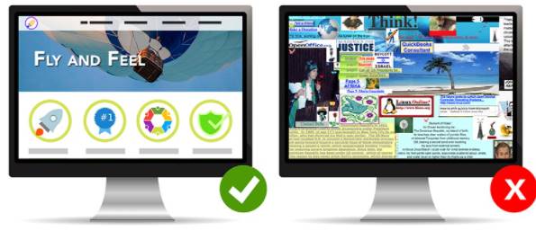
Designing a website is probably not as difficult as it used to be. Nowadays, everything is becoming more and more complete, you can learn these things on your own online without having to go to university or learn from anyone. And in the process of learning, you already know how to build a website, but you don’t know how to design it so that the product fits and is beautiful so that users can have a good overview of your website.
| Join the channel Telegram of the AnonyViet 👉 Link 👈 |
So in today’s post, I will list some mistakes that you often make in the process of designing your website.
1. Poor navigation
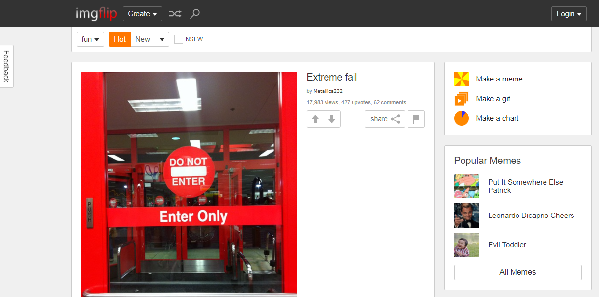
Poor navigation, forcing users to click on many links to see the content is a common mistake when designing Websites. Have you ever visited a website to find and download or get information about something? Most websites lose 50% of their users from this, simply because your article title says Download, get this information but the article doesn’t provide it.
Or simply, you can’t navigate to the home page with something and the only way is to retype homepage and enterd. That makes visitors to your website quickly leave because they are lazy.
You should put things related to the article close together so that users can easily search and click on it.
2. Small font
If your font is too small, it can make it difficult for users to read it, this is a common mistake when designing websites. On average, it takes 8 seconds to get someone’s attention. If the font is too small it can make users feel frustrated and will take the fire away from your website because small font can make them hurt their eyes, be blinded when trying to read. You should add a font size enlargement function like AnonyViet to make it easier for users to read the text. Just click on the letter Aa to make the font bigger.
3. Too much information
Exactly like the title. An article with too much information will make readers feel bored because it is difficult to find what they are looking for because it has too many words and words. And there is a lot of superfluous information unrelated to the article.
In short, you should learn about the article you intend to write and then select the information to use.
4. Color
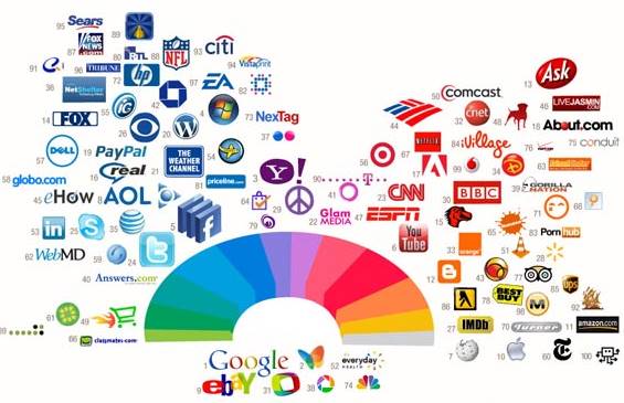
This is probably the most important part of website design. The design of this color is very important because many people who are new to a website if they find the color boring to look primitive and hurt their eyes, they will immediately leave.
You should optimize the color and contrast of your website. Should mix colors like black, yellow, white for easy viewing and eye-catching, but if the color scheme is too bright, too dark, but too much, it will cause the reader to suffer from blue light glare and eye pain, greatly affecting the eyes.
5. Too much advertising
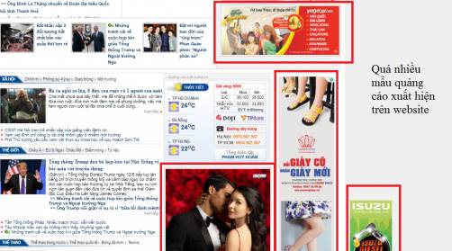
As the title says, every website relies on advertising to make a living, but there are some for-profit websites that don’t put customers first, but put advertising first. When a new user enters the website, they will probably get 6.7 ads at the same time or even visit the website 2, 3 and still have ads. Usually people get annoyed and use Adblock to block ads.
So please use less ads. Don’t overdo it


