Microsoft Excel is a spreadsheet software commonly used in statistical calculations, with many hidden functions. It’s easy to understand why novices will find it difficult to learn Microsoft Excel. You are not the only one, so in this article, I will guide you through 8 tips to learn Microsoft Excel quickly.
| Join the channel Telegram of the AnonyViet 👉 Link 👈 |

Is Microsoft Excel difficult to learn?
A quick Excel learning tip is to break down the learning process into manageable chunks. You can’t learn Excel in a day or a week, but if you learn and master each individual part, it will be easier to control the knowledge and easier to learn.
Basic knowledge
Here are some first Excel learning tips you need to master if you want to better understand Microsoft Excel. They’re mostly pretty simple, but it’s important that you’re familiar with them before you start working on more complex tasks.
1. Simple math
Let’s start with the most basic math operations you’ll need to solve in Microsoft Excel. Every calculation you do in Excel begins with an equal sign “=”.
Import =10+10 Enter a cell in your spreadsheet and press Enter, the cell will display the number 20.

Note: you need to use an asterisk “*” instead of the multiplication sign and a slash “/” instead of the division sign.
2. Using AutoSum
If you’re just starting to learn Microsoft Excel, this is a great way to get acquainted with functions. First, enter any two numbers in the boxes next to each other. Next, select the empty box next to those 2 cells and go to Home > AutoSum.
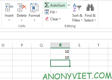
This will automatically fill the selected cell with the SUM formula. Excel adds the two numbers together and gives the result in the specified cell — using the AutoSum menu, you can also select different functions.
3. Apply Number format
As your spreadsheets get a little more complicated, they can contain different types of data like currencies, dates, percentages, and more. To make sure you can work with this data, you should format it.
Select the cells you want to format. Find the section Number at the top of the screen and find the menu General.
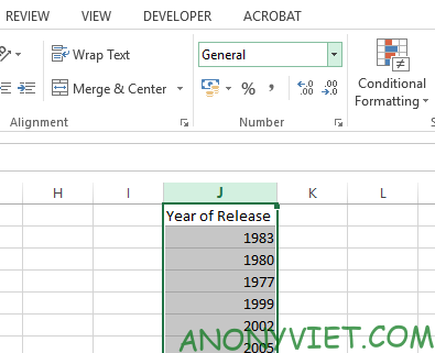
From there, you can choose different data formats. If you want more formatting styles, choose More number formats at the bottom of the menu and you’ll be able to specify details like decimal places or currency.
4. Create table
Presenting your data as a table allows you to more easily manage and organize your data. Select the entire dataset you want to turn into a table and click the shortcut Quick Analysis in the bottom right corner as shown below.
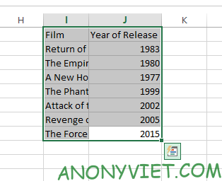
Navigate to the tab Tables and choose Table. If the Quick Analysis shortcut doesn’t appear, simply select your data and go to Insert and choose Table.
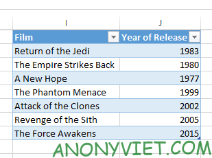
Use the arrow buttons in the table header cell to filter out specific data points or arrange them however you like.
5. Create a chart
You can create a chart or graph the same way you create a table.
Excel provides you with many different types of charts. First, select all your data.
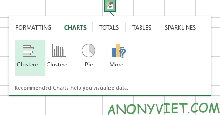
Then select the Quick Analysis shortcut and go to the tab CHARTS.
If Quick Analysis does not appear, select your data and press Insert. Then navigate to section Charts. Here you can choose a recommended chart or choose your own.
Advanced knowledge
Sooner or later, you will also want to improve your skills in using Excel. And what you need to do that is to use functions and formulas in Excel.
6. Use the manual function
Once you have mastered basic math in Microsoft Excel, you will discover a lot of interesting functions.
Let’s start by using one of the most basic functions available in Excel which is SUMMARY. We can use this function to sum the selected cells.
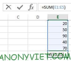
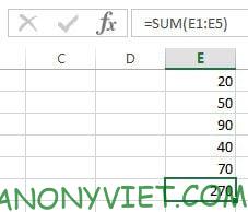
As the picture above, I have five numbers and want to add them together, so I used the SUM function to calculate the sum from cell E1 to cell E5 by entering =SUM(E1: E5).
Alternatively, you can also enter individual cells separated by commas if the cells are not consecutive.
7. Conditional Formatting Integration
In recent years, Microsoft Excel has evolved into a powerful tool for creating dashboards as well as regular spreadsheets. Creating dashboards in Microsoft Excel can achieve many benefits, depending on your needs. One of the quick tips to learn Excel is to use the features available on the toolbar.
Conditional formatting is a way for you to make data different when conditions are different. Eg: color the box with even numbers red, color black for those under 18 years old.
For these reasons, I’m going to use conditional formatting to quickly filter some data. Select data and enter Home > Conditional Formatting.
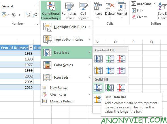
You will find tons of different formatting options. I chose percentages, your spreadsheet has become more intuitive, and you can also use colors as you like.

8. Add trendline to chart
The key to become a Microsoft Excel expert is to use all the tools the software provides to create the perfect chart for your needs. Trend line (trendline) is one of many components that you should consider.
Click on the chart and then click Chart Elements There is a plus icon.
You can quickly add a trendline by clicking the arrow to the right to access more detailed options.
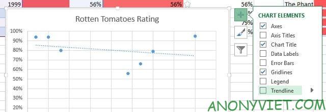
Trendlines don’t always help, so think twice about the data you’re presenting. Also, see if the trendline is contributing to your chart or just making things more confusing.


