In this article, I will show you how to create a chart in Excel.
| Join the channel Telegram of the AnonyViet 👉 Link 👈 |
How to create a chart in Excel
1. First, enter the number in the range C4:C8.
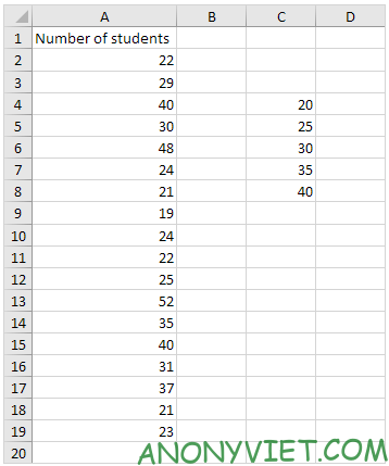
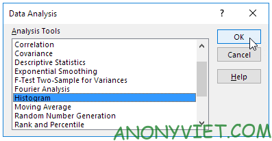
2. On the Data tab, select Data Analysis.

3. Select Histogram and click OK.
4. Select range A2:A19
5. Click the Bin Range box and select the range C4:C8.
6. Click the Output Range option button, click the Output Range box, and select cell F3.
7. Check the Chart Output.
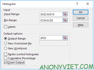
8. Press OK
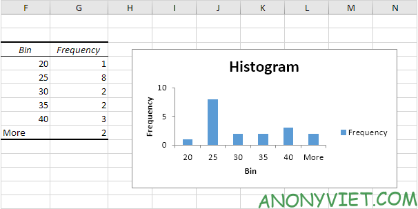
9. Click the caption on the right side and press Delete.
10. Label your bins.
11. To remove the gap between the bars, right click on a bar, click Format Data Series and change the Gap Width to 0%.
12. To add a border, right-click a bar, click Format Data Series, click the Fill & Line icon, click Border, and choose a color.
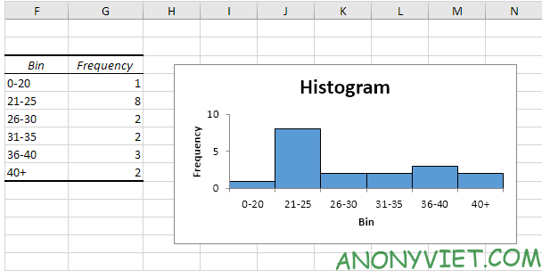
If you have Excel 2016 or later, just use the Histogram chart type.
13. select range A1:A19
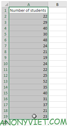
14. On the Insert panel, select the Histogram symbol.

15. Click on Histogram.
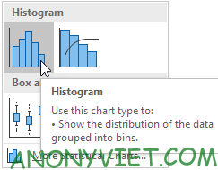
Result
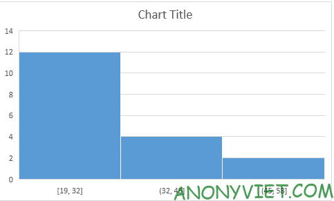
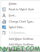
16. Right-click the horizontal axis, and then click Format Axis.
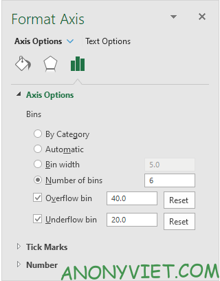
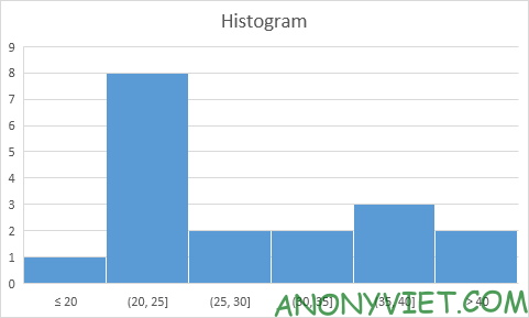
17. Determine the bins of the chart. I will use the same bins as before (see first image on this page). Bin width : 5. Number of bins : 6. Overflow : 40. Underflow : 20.
Result
In addition, you can also view many other excel articles here.


