This article will guide you to use the Axes chart in Excel.
| Join the channel Telegram of the AnonyViet 👉 Link 👈 |
Axes
Most chart types have two axes: the horizontal (or x-axis) and vertical (or y-axis). This example shows you how to change the axis style, add axis titles, and how to change the scale of the vertical axis.
1. Select the range A1: B7.
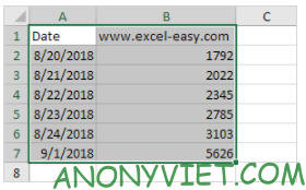
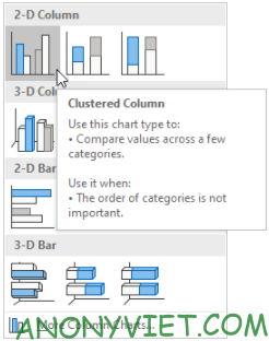
2. On the Insert tab, click the Columns icon.

3. Click Clustered Column.
Result

Shaft type
Excel also displays dates from August 24, 2018 to January 9, 2018. To remove these dates, I had to change the axis type from Date Axis to Text Axis.
1. Right-click the horizontal axis, and then click Format Axis.
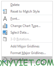
2. Click Text axis.

Result

Shaft ratio
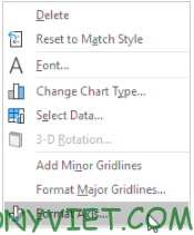
1. Right-click the vertical axis, and then click Format Axis.
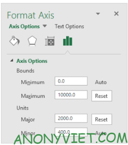
2. Change the maximum bound to 10000.
3. Fix the major unit to 2000.
Result:

In addition, you can also view many other excel articles here.

