This article will show you how to create a candlestick chart in Excel. Candlestick charts show the minimum, 25%, median, 75% and maximum values of the data set.
| Join the channel Telegram of the AnonyViet 👉 Link 👈 |
Create candlestick chart in Excel
1. For example, select the range A1:A7.

Note: you don’t need to sort the data from smallest to largest.
2. On the Insert tab, in the Charts group, click the Statistic Chart icon.

3. Click Box and Whisker.
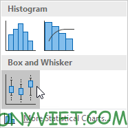
Result:
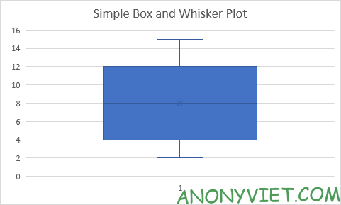
Explanation: the middle line of the box represents the median or middle number (8). The x in the box represents the mean (also 8 in this example). The median divides the data set into lower halves {2, 4, 5} and upper halves {10, 12, 15}. The bottom line of the box represents the mean of the bottom half or 25% (4). The top line of the box represents the mean of the top half or 75% (12). The whiskers (vertical line) extend from the ends of the box to the minimum value (2) and the maximum value (15).
Exotic
1. For example, select the range A1:A11.
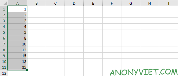
Note: the median or middle number (8) divides the data set into two halves: {1, 2, 2, 4, 5} and {10, 12, 15, 18, 35}. The first quartile (Q1) is the average of the first half. Q1 = 2. The third quartile (Q3) is the median of the second half. Q3 = 15.
2. On the Insert tab, in the Charts group, click the Statistic Chart icon.

3. Click Box and Whisker.

Result:
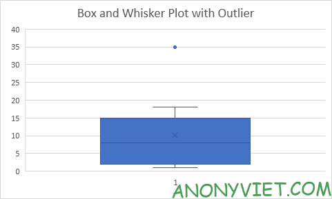
Explanation: the interquartile range (IQR) is defined as the distance between the first and third quartiles. In this example, IQR = Q3 – Q1 = 15 – 2 = 13. A data point is considered outlier if it exceeds the IQR distance 1.5 times below the first quartile (Q1 – 1.5 * IQR = 2 – 1.5 * 13 = -17.5) or 1.5 times the IQR on the 3rd quartile (Q3 + 1.5 * IQR = 15 + 1.5 * 13 = 34.5). Therefore, in this example, 35 is considered an outlier value. As a result, the top whiskers expand to the largest value (18) in this range.
4. Change the last data point to 34.
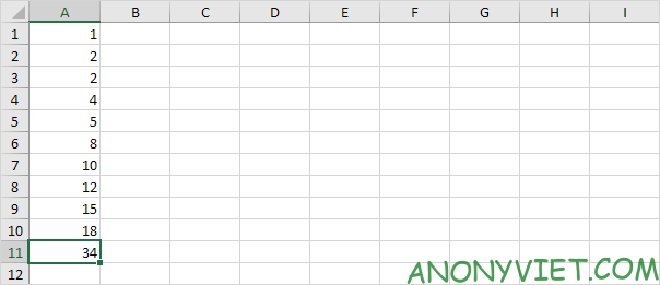
Result:
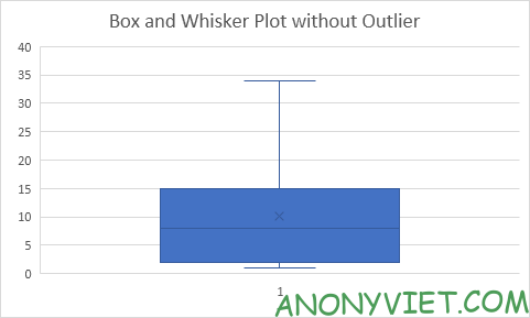
Explanation: all data points are between -17.5 and 34.5. As a result, whiskers expand to the minimum value (2) and the maximum value (34).
Calculate percent
1. For example, select even data below.

2. On the Insert tab, in the Charts group, click the Statistic Chart icon.

3. Click Box and Whisker.

Result:

Explanation: Excel uses the QUARTILE.EXC function to calculate the first quartile (Q1), second quartile (Q2 or median), and third quartile (Q3). This function interpolates between two values to calculate a quarter. In this example, n = 8 (number of data).
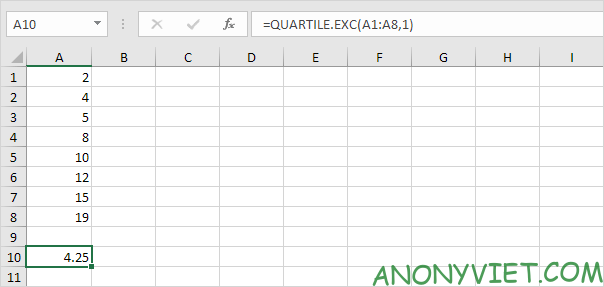
4. Qfirst = 1/4*(n+1) = 1/4*(8+1) = 2 1/4 = 4 + 1/4 * (5-4) = 4 1/4. You can verify this number using the QUARTILE.EXC function below.
5. Q2 = 1/2 * (n + 1) = 1/2 * (8 + 1) = 4 1/2 = 8 + 1/2 * (10-8) = 9. Median is the average of two numbers in the middle.
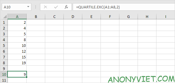
6. Q3 = 3/4 * (n + 1) = 3/4 * (8 + 1) = 6 3/4 * = 12 + 3/4 * (15-12) = 14 1/4 . Again, you can verify this number using the QUARTILE.EXC function.


