Knowing the tricks to make your slideshows clear will make your presentation a success. Slideshows are the most intuitive way to share complex ideas with an audience, although they are pretty bland and ugly when the author doesn’t know how to implement ideas and designs. So, in this article, I will introduce some tips to help with the presentation PowerPoint Yours becomes more beautiful and interesting.
| Join the channel Telegram of the AnonyViet 👉 Link 👈 |

What is the goal of the presentation?

First you must define the purpose of the presentation. Is it informative and easy to understand? Or is it a pitch, to convince the audience and lead them to a specific outcome?
This is exactly the problem most presentations face when it is not possible to identify the best arguments to support our goal. For example, the main goals include: to entertain, to provide information or to share data, to critique or to present an issue. Use facts, figures, and images to support your presentation.
I recommend introducing the ending first. When the audience knows the end of the presentation, they will be able to see what they memorized and analyzed to get to your conclusion. From there they will focus and listen to your presentation more.
Using Templates
Of course, using a beautiful PowerPoint template will make the presentation more impressive. So AnonyViet shared a lot Beautiful Powerpoint Template Free with many topics such as business, study, job application…
If you really don’t know how to design or create layouts, then Templates will save you. My favorite PowerPoint Templates page is SlideGo. Because it’s beautiful and free. But Slide is just a tool to help you present better. Remember, it all depends on your presentation skills.
As simple as beautiful
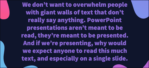
Item PowerPoint Yours shouldn’t contain everything. Let’s introduce a topic on Slide, one that we can explain with a presentation. The more redundant information, the easier it is for the audience to be distracted. It makes the presentation less interesting and less interesting, and no one will listen to you, because what they are focusing on right now is reading a bunch of information on your Slide. Get your audience’s attention, Slides are just an auxiliary tool for your presentation, remember.
This applies to the Slide as shown above. In fact, there is nothing worse than when the presenter just reads the information on the slide. Your audience is likely to read and they will most likely finish reading the slide before you. Remember to avoid putting text on the Slide.
Typeface review
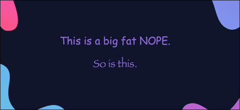
I recommend not using Papyrus and Comic Sans in all PowerPoint presentations. In addition, you need to consider the typeface you are using, the presenter, and the PowerPoint slide itself.
Consider choosing between legibility over aesthetics and avoid fancy fonts that can be distracting. A good slide needs two fonts: serif and sans-serif. Use one for titles and one for content, lists, and the like. Veranda, Helvetica, Arial, and even Times New Roman are safe choices.
Headline symbol
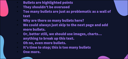
Bullets assist the presenter, making information easier for the audience to read. In fact, the best slides should have little or no text at all. As a presenter, it’s your job to talk about the issues that need to be covered, but that doesn’t mean we need to highlight every point.
Instead, divide your content into 3 or 4 bulleted lists. Be careful when using bullets, you need to make sure the content is bulleted and not too long. If you can’t, remember that there is no limit to the number of slides in a presentation. It is always possible to split a 12 bulleted list into three Slides, each with four tiles.
Limit the use of effects
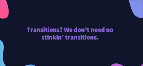
The effect, when used properly, will bring out its full effect. It breaks down slide movements and adds actions to user elements. But it should be used with caution.
For example, adding a left-to-right transition between every slide or animating each bullet point will feel inhibited and uncomfortable for the audience. Viewers quickly get bored and the effects will gradually become scary.
That’s not to say you can’t use animations and transitions, just that you need to be careful when using them. Use them for specific purposes, or you want to clarify a point in a presentation.
Ignore text if possible

Sometimes images are easier to express than text. Your goal is to be as detailed as possible without forcing the user to read a lot. In these cases, well-designed images, like charts, will communicate better.
The right image in the right context makes your presentation more concise, clear, and intuitive. For example, boring statistics tables, try turning it into animated charts with representative images will be much more interesting. Here’s another cinematic term you can use: “Show don’t tell”.
Color combination

Color is also one of the deciding factors for your presentation. If you have the right color scheme, it will be easier for your audience to notice and focus on your presentation. But if you don’t know how to color or mix it wrong, before you speak, you’ve failed. So, I will introduce you to a website that helps us color PowerPoint extremely beautifully happyhues or colorhunt.
Slide Sort
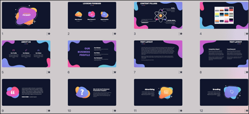
Spend some time in Slide Sorter before you finish your presentation. By clicking the four squares at the bottom left of a slide, you can view multiple slides at once and see how each one performs. Alternatively, you can click “View” on the ribbon and select “Slide Sorter”.
From this mode, you can review and rearrange the order in which each slide appears. The difference between a good presentation and a bad one is really preparation and execution. Those who follow the process and plan carefully — not just the entire presentation, but care about every slide — are the ones who succeed.


